
Start with your core message
How do you start making your complex document easier to understand? How about with the story you want to tell the reader and the corresponding core message. Keep in mind that your user receives this document within a broader user experience where they come into contact with your service in different ways.
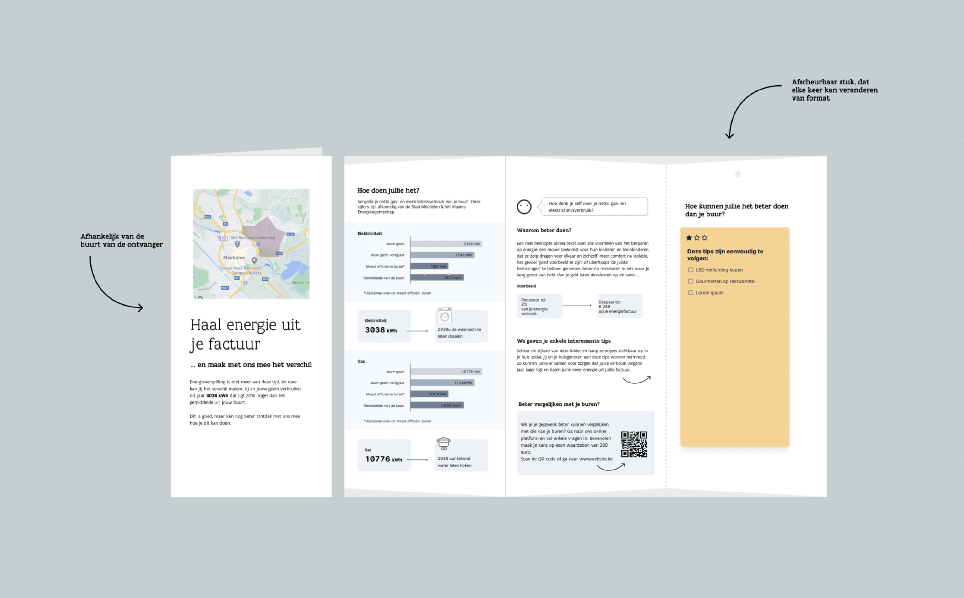
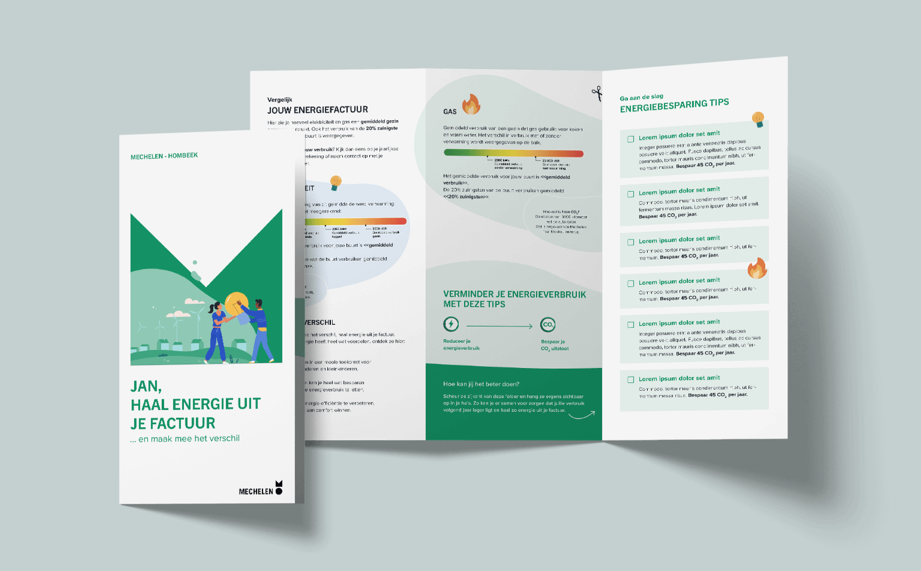
Once you’ve defined the core message, you can start formatting your document. In the first design phase you can take a high level approach using wireframes - schematic representations of what the document will look like. This process helps determine the placement and hierarchy of images and text. The specific content is not yet finalised, but there is an idea of the purpose of each block. This content can be further refined in later phases until everything has been given a proper place. This is also how we worked on the brochure "Get energy from your bill" for the city of Mechelen:
Always put your user first
During the design process of your document, it’s important that you always know for whom you are designing and what specific obstacles they may encounter. Make sure the document is always readable and understandable, both in terms of language and design.
In terms of language, we recommend keeping it simple. This can be done by removing technical jargon from your texts or by explaining difficult terms concisely. And what if someone with dyslexia or a mother tongue other than Dutch gets hold of your document? Het huis van het Nederlands made a nice list of the aspects you can take into account for clear language use. A good example is the Dutch pronunciation "in acht nemen" (take into account), where non-Dutch speakers read the word 'acht' as the number. It is best to avoid this wording. (source)
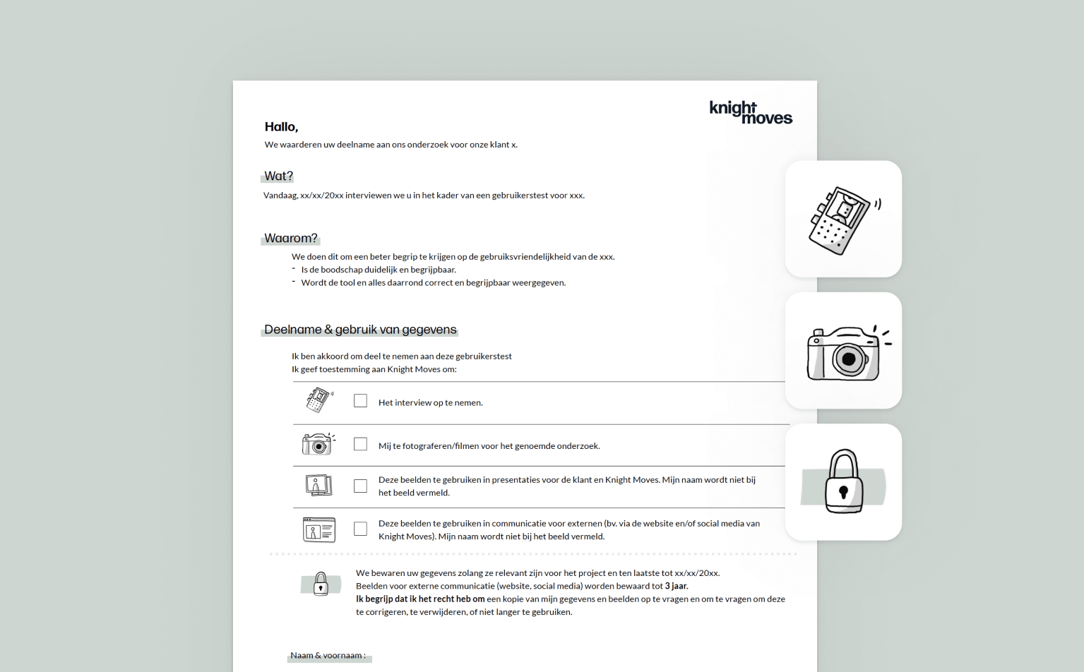
In addition, it’s also important to put the user first when designing your document. Take into account the literacy of your user, because visual design can support this. For instance, within Knight Moves we designed a consent form for data protection. We use this, for example, when conducting user tests or interviews with end users. The form contains different options to indicate what you do or do not agree to, and we built it in such a way that the icons next to the dots always reinforce the content of the text. This way, a user who is less literate can understand and give their approval based on the icons and extra explanation, without having to fully understand the text.
Testing, testing & testing
Based on the first version, we test where the document conveys the message well and where it can be improved. We do this early enough in the creation process so that we can still make adjustments where necessary. Testing can be done with a wireframe from one of the first design phases, as well as with a more elaborate version. Here, we not only test the desirability of the document, but also its usability and how effectively it conveys the message. Make sure the participants in your user tests are diverse and represent your target group well. For example, they could be people with dyslexia, a different mother tongue or impaired vision. The more variety, the more interesting your tests will be. For the "Energy Performance Certificate" (EPC for short), we also organised numerous user tests. From these, we extracted a lot of useful information, both in terms of design and syntax. This gave us the opportunity to work further on the design in order to ultimately deliver a document that is as customer-oriented as possible. Interested in how we do user testing? Read all about it in organising user testing.

Summarised
Methodologies for user-centred design are perfectly applicable to physical documents. It ensures that a seemingly complex document can become more accessible for the end user. It’s important to define your core message well: keep the bigger picture in mind first and only then zoom in on the details. In addition, it is essential to know your reader well: what does he or she need? How do they obtain information? Finally, sit down with your target audience and test your document with them. This may mean a drastic pivot in your design or content structure, but it also ensures that your final design will ultimately be better understood by the target group.
So print is definitely not dead yet, in fact: there are still endless possibilities to further explore how we can optimise the design process of complex physical documents.
Call To Action
Do you also want to make complex documents understandable for everyone? Send us a message.